CLARITY. PRECISION. STRENGTH.
The black-and-white logo reflects the essence of photography itself -the dialogue between light and shadow, contrast and balance. Its minimalist form reflects a refined focus on what truly matters: the story, the emotion, and the moment captured through the lens.
Clean lines and a balanced geometric frame express elegance and consistency, while the open space within the design suggests creative freedom and strong vision.
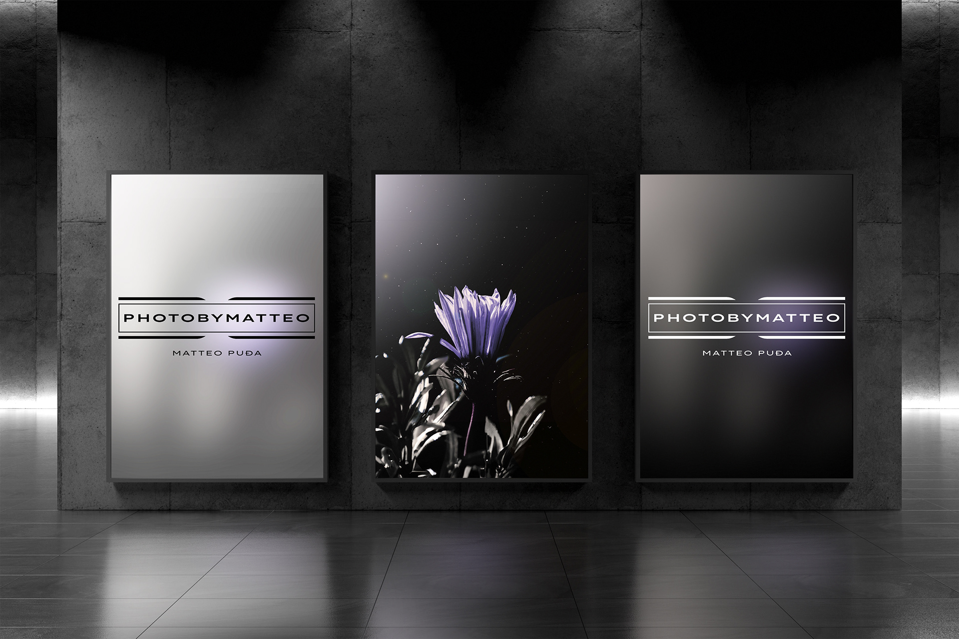
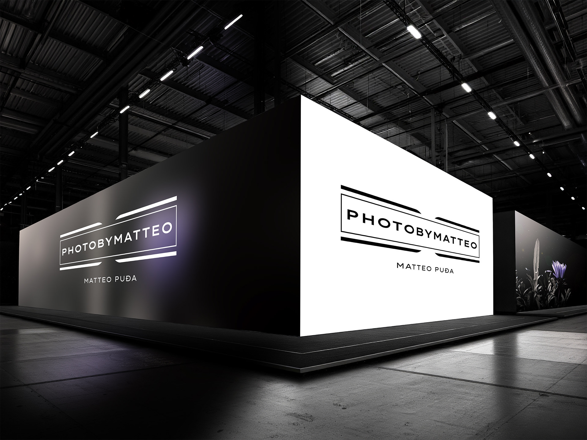
Photobymatteo™ stands for visual clarity, authenticity, & refined aesthetics, representing photography that doesn’t seek attention but effortlessly holds it.
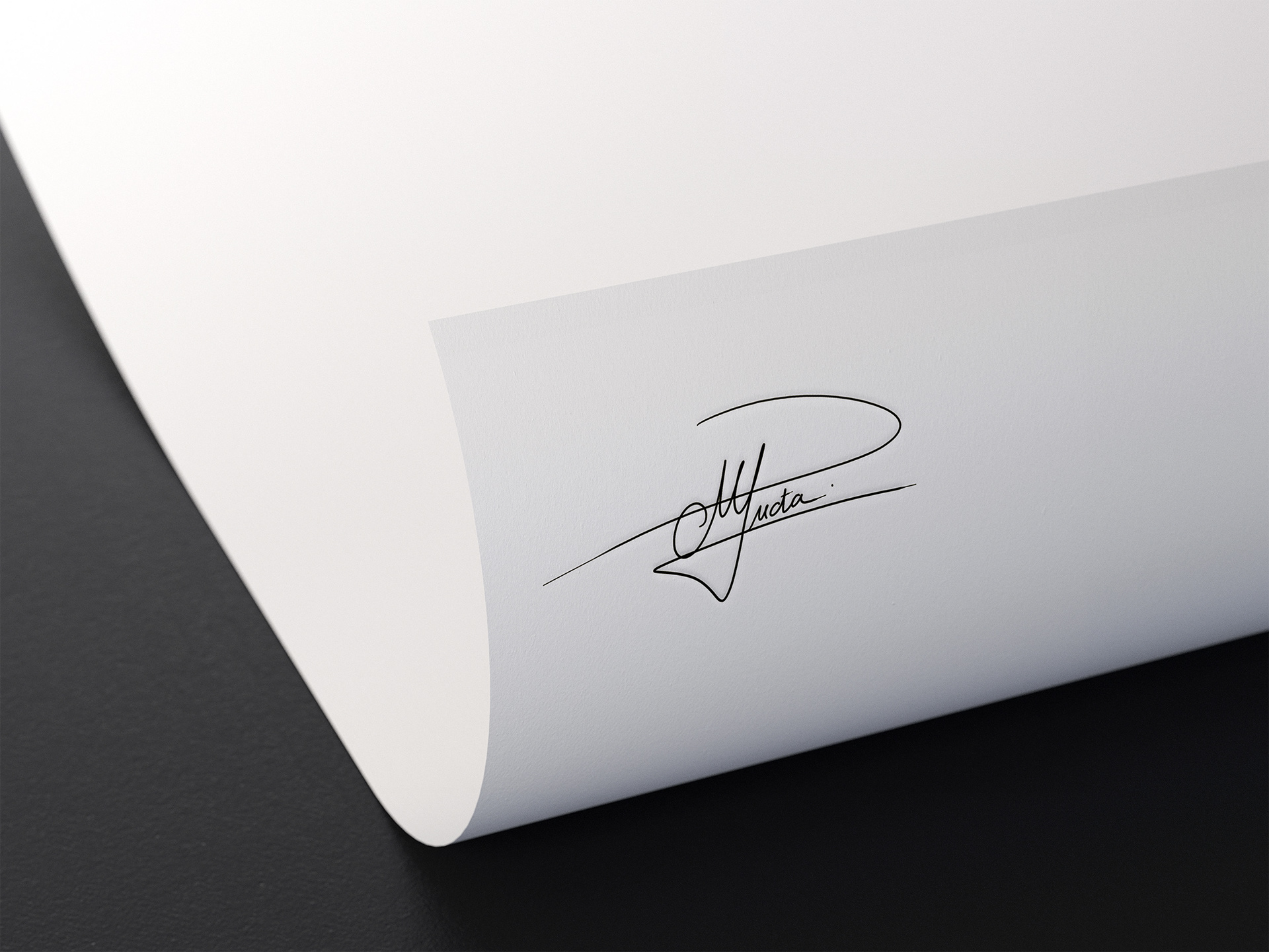
THE MARK OF AUTORSHIP
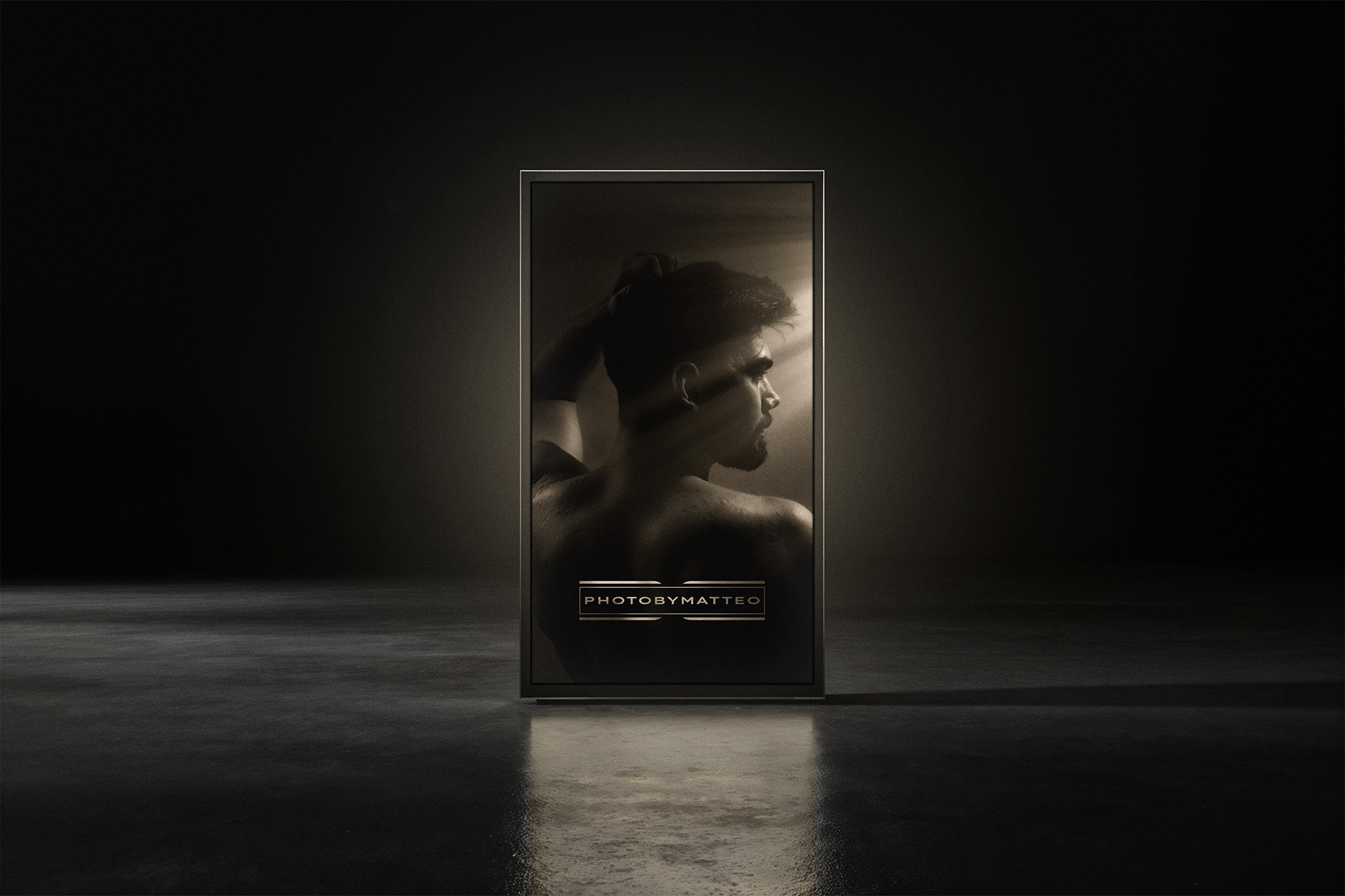
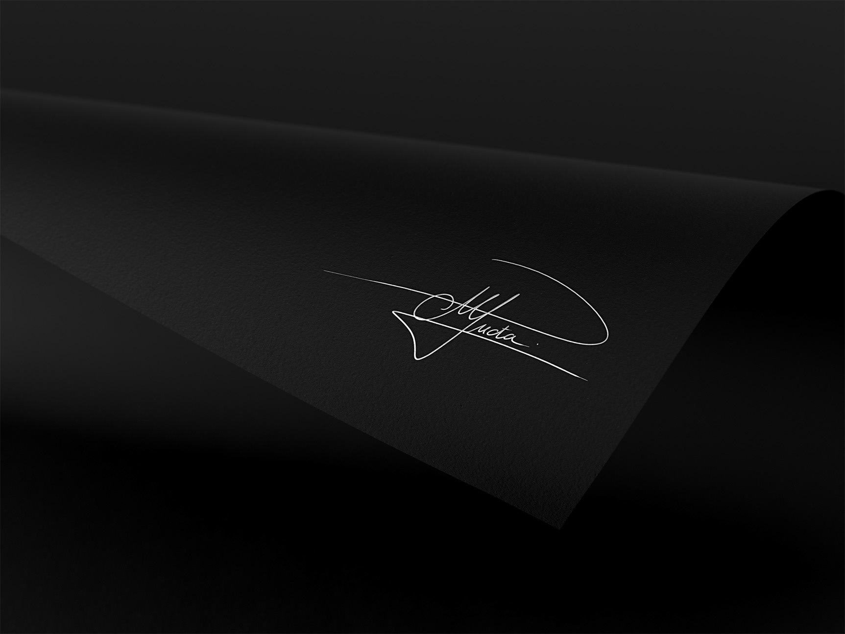
The handwritten signature placed on selected works adds a personal touch to this otherwise minimal and structured identity. It combines the technical precision of the image with the human emotion behind it, meaning that every frame, no matter how meticulously composed, originates from an individual vision and a personal connection to the art itself.
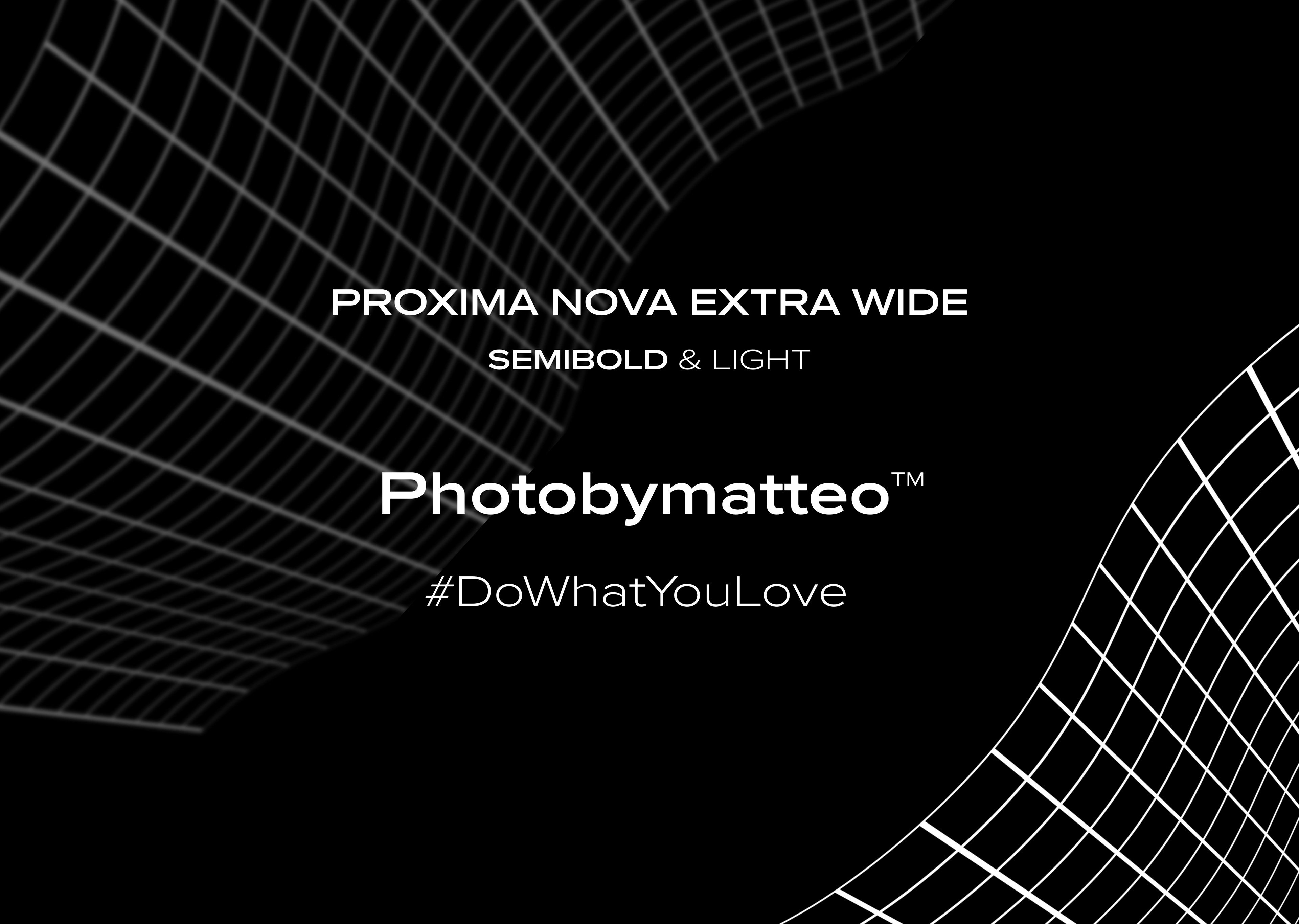
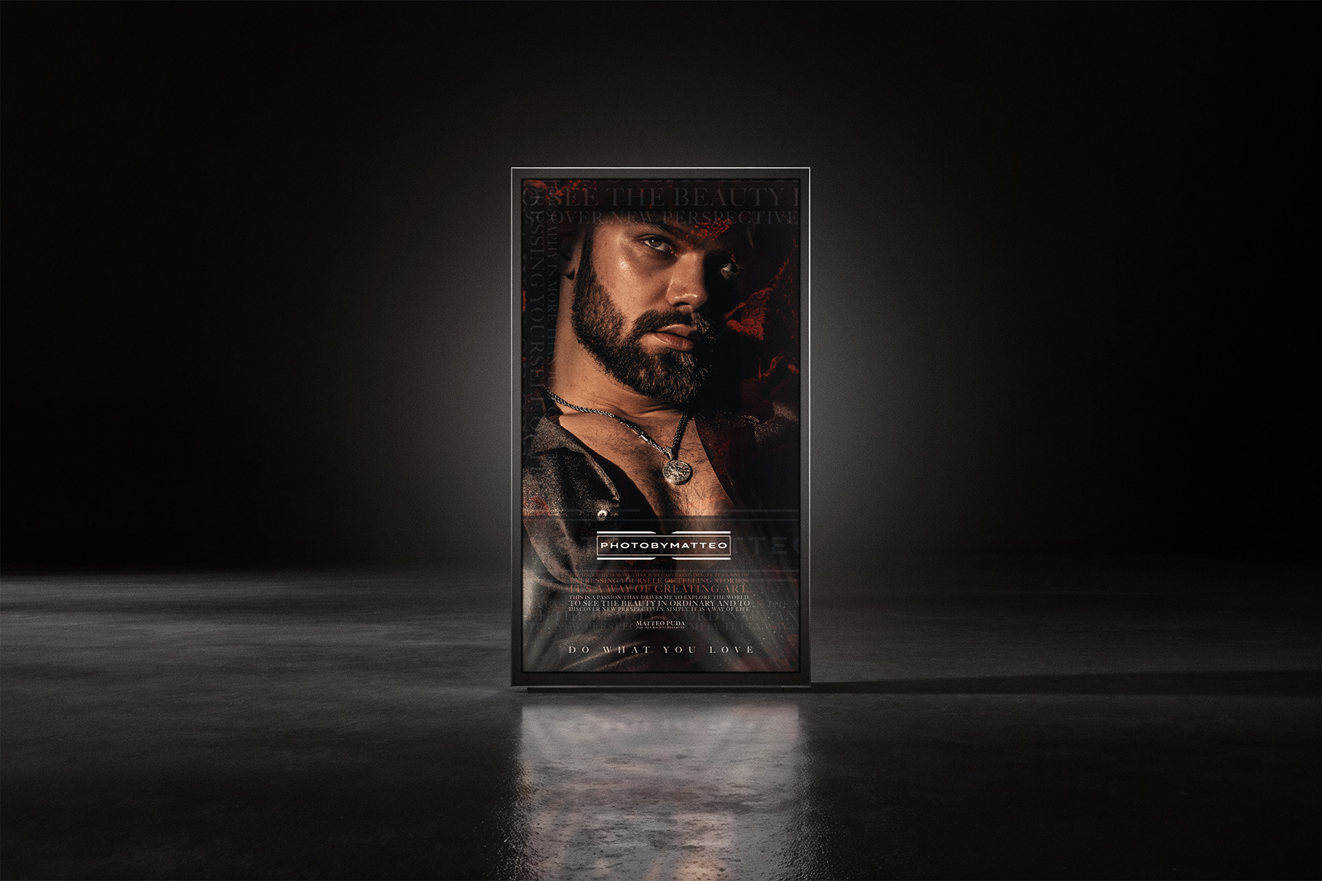
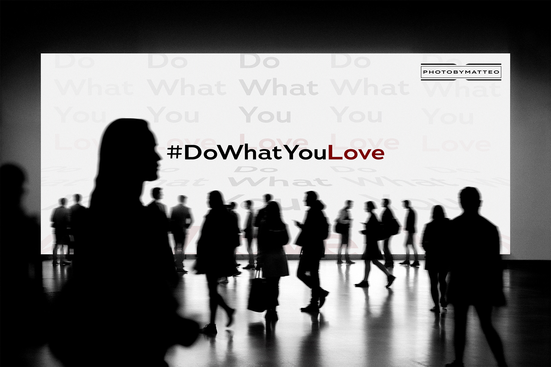
#DoWhatYouLove
The phrase #DoWhatYouLove is more than a slogan; it’s the core principle behind Photobymatteo™. It represents a way of working and living that prioritizes passion, authenticity, and a creative spirit over trends or convention. Photography, in this philosophy, is not just a profession but also a dialogue with the world.
In a world often defined by speed and replication, #DoWhatYouLove serves as a reminder to slow down, observe, and create something genuine.
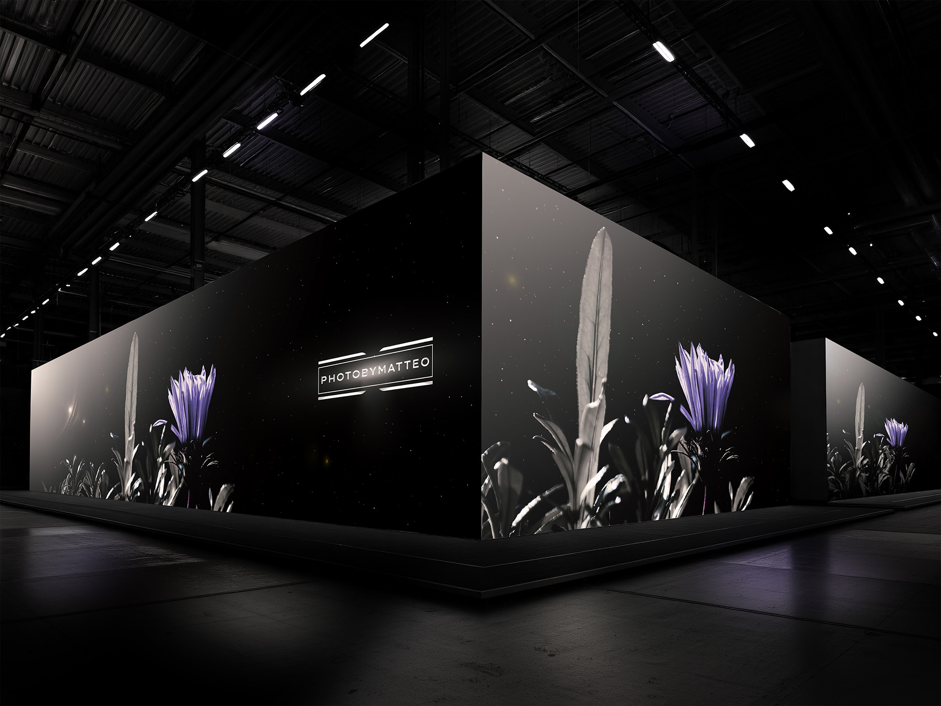
THE COLOR OF TRANSFORMATION
The purple color palette, drawn from the flower petals, adds a subtle yet powerful and emotional touch to the visual identity. This is the color of depth, sophistication, and sensibility. The flower and its colors are the symbols of creativity, introspection, and artistic transformation.
When used in contrast with a dark, surreal, cosmic foundation, purple emerges not as ornament, but as the central emotional anchor of Photobymatteo™ artistry: refined, impactful, and unforgettable.

Official Photobymatteo™ artistry cover
VISUAL RATIONALE for TYPOGRAPHY
The typography for the Photobymatteo™ visual identity was strategically selected to reflect the brand's core philosophy: the intersection of raw human emotion and refined technical precision. By blending three distinct typefaces, a sophisticated visual hierarchy that mirrors the depth of photography is born.
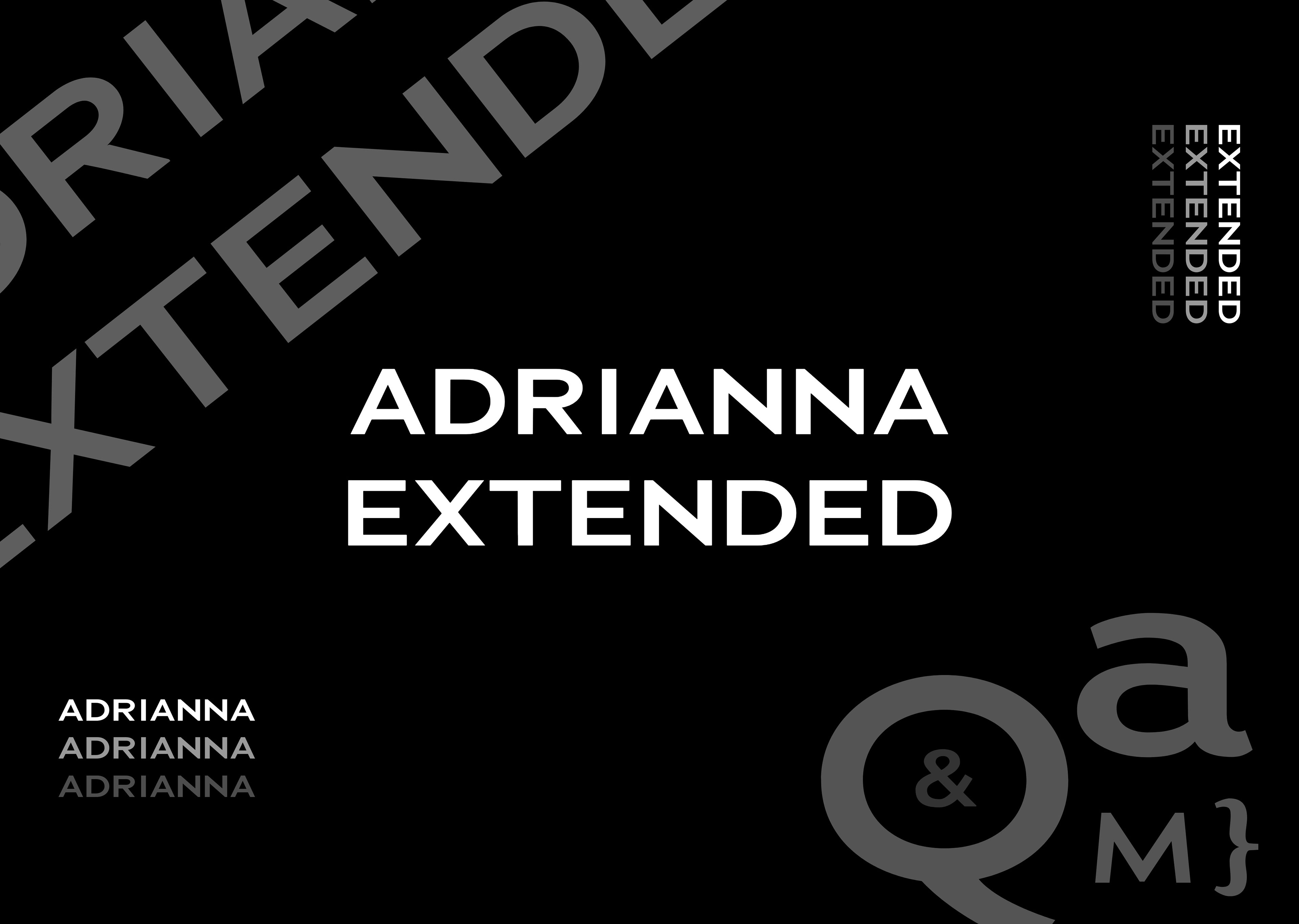
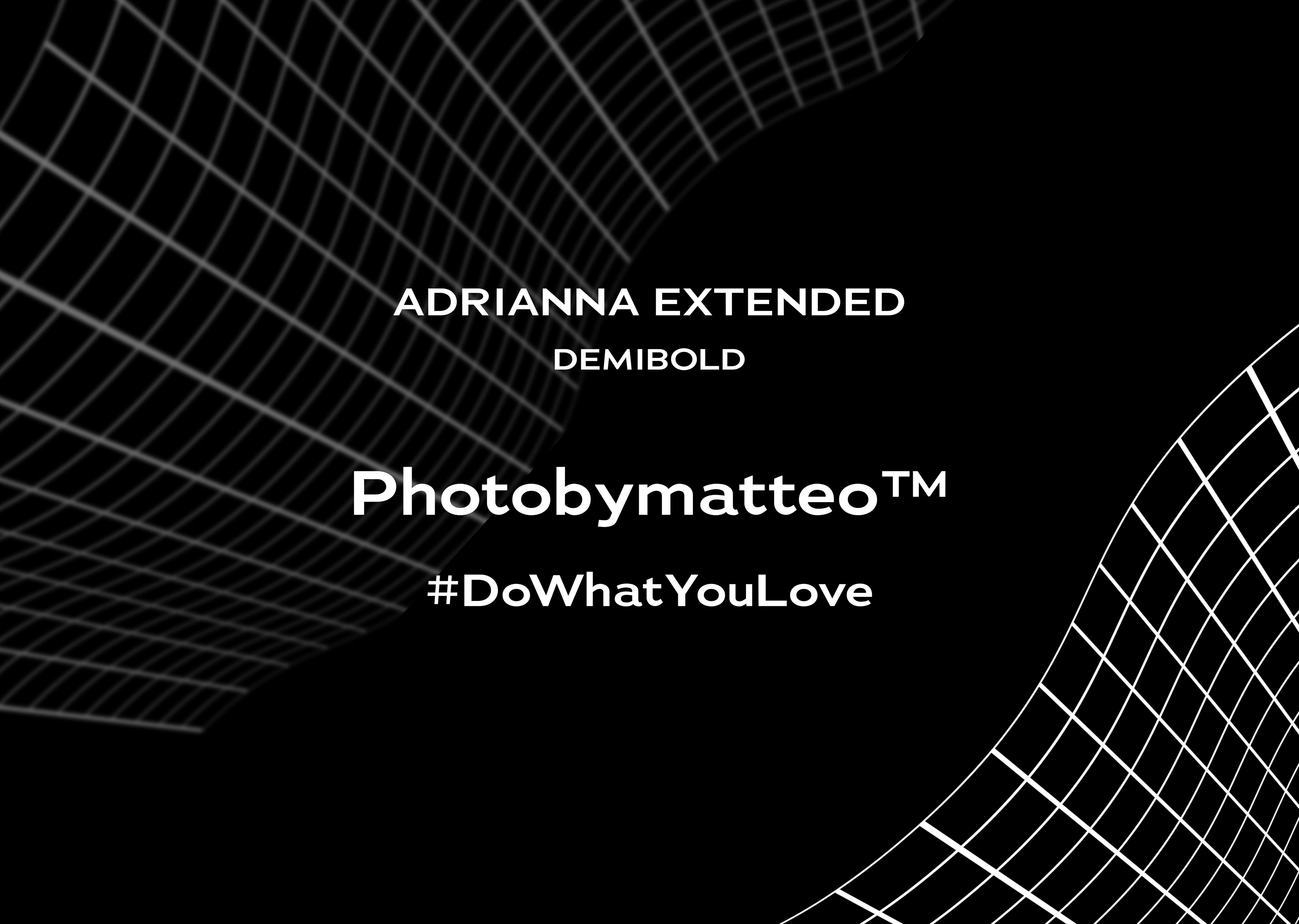
Adrianna Extended Demibold - Structure
Wide, geometric, authoritative, and confident presence, main heading font, following the avant-garde nature of the brand.
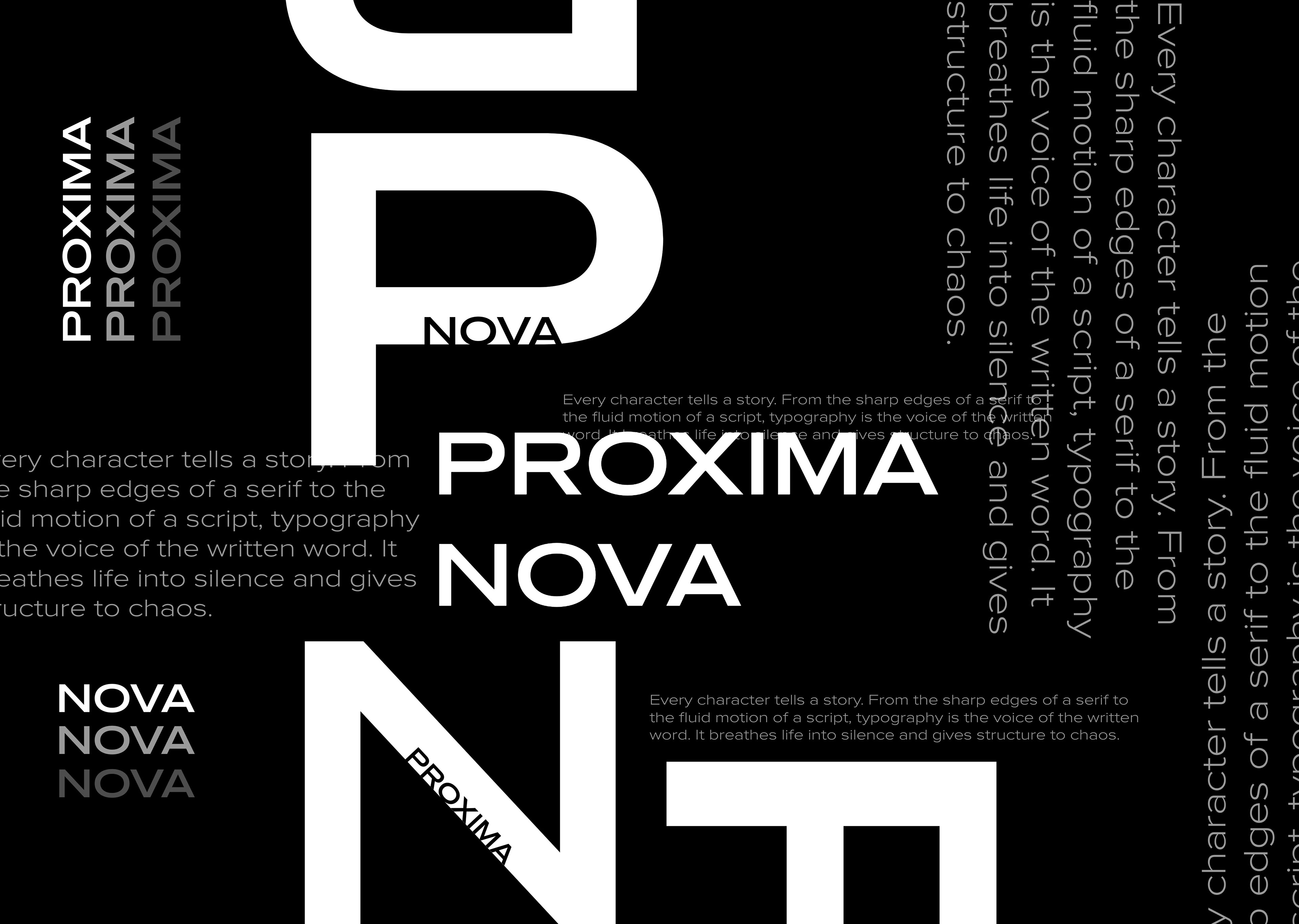
Proxima Nova Extra Wide - Clarity
For the body copy, an unmatched choice for legibility, classic but premium, open spacing that elevates the text to a design element.
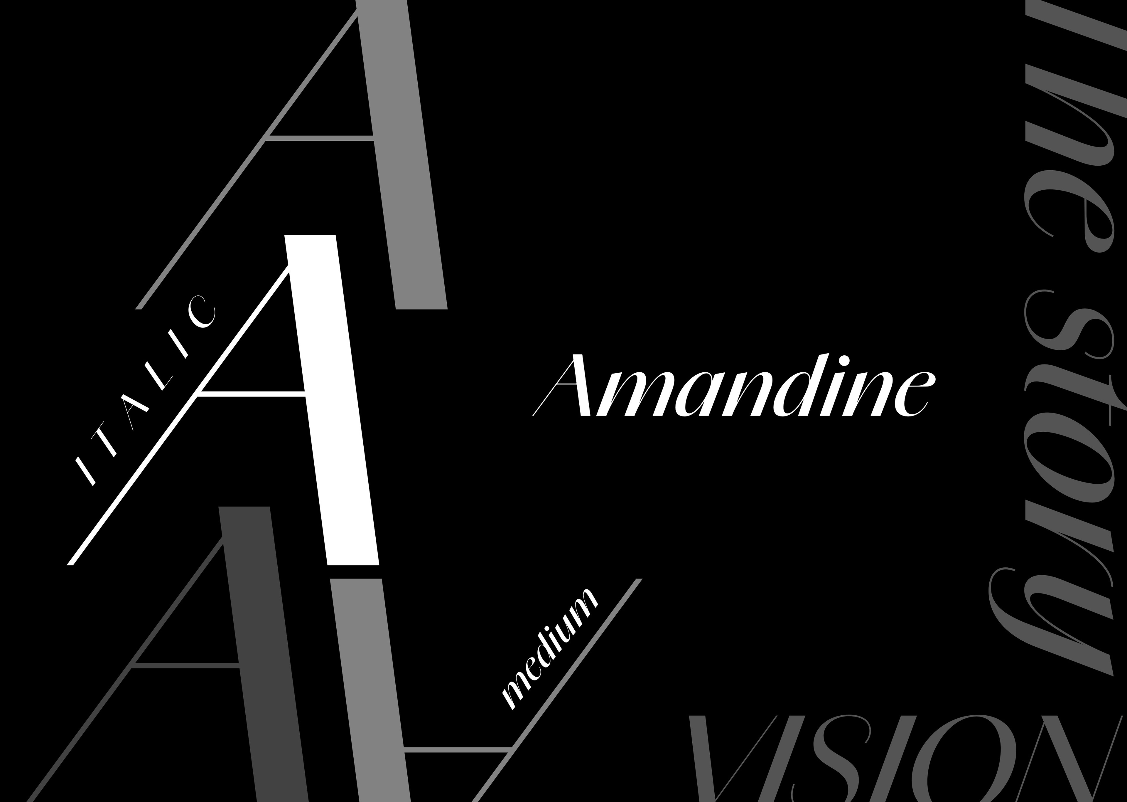
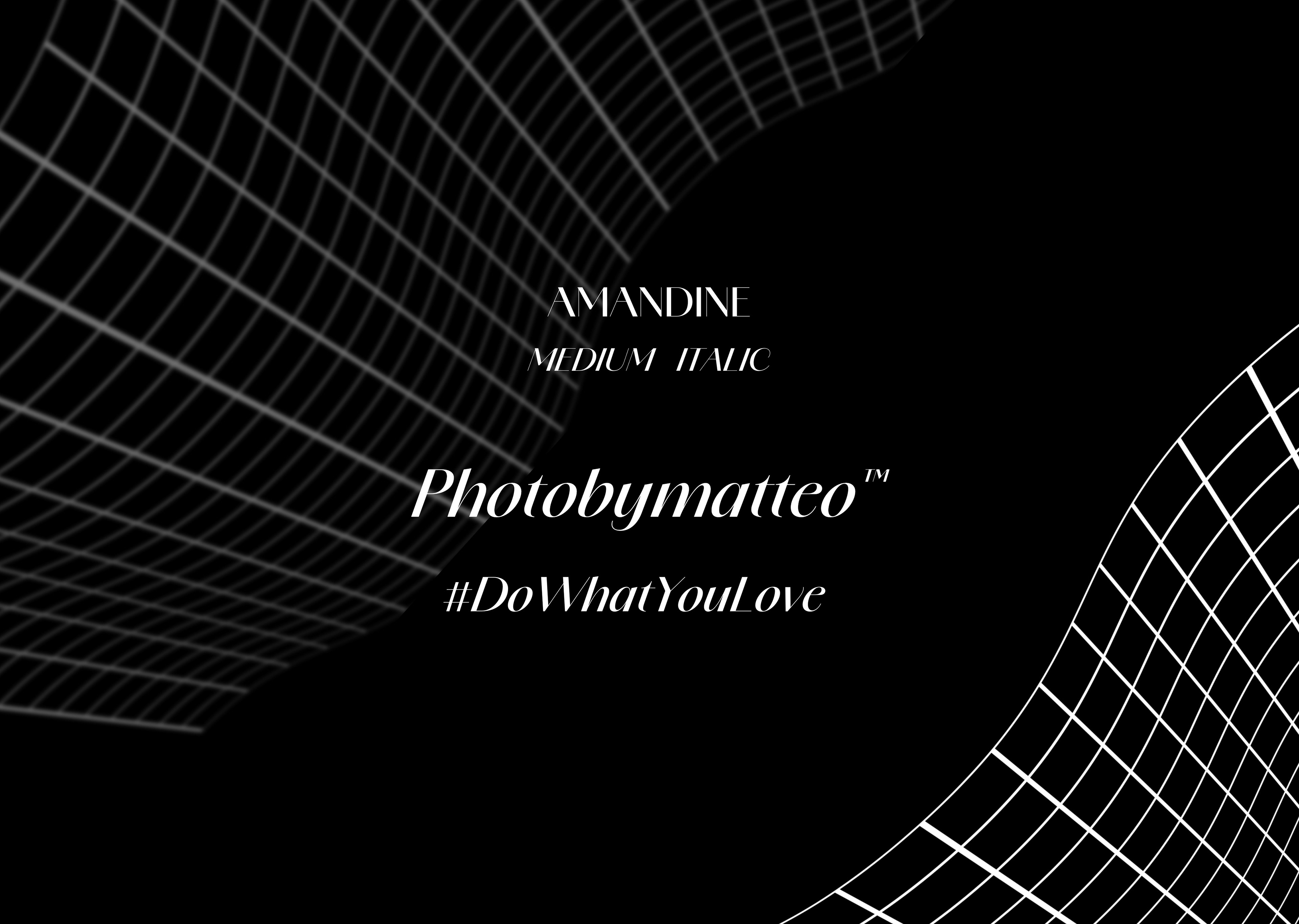
Amandine Medium Italic - Art
Serving as the soul of the brand, fluid calligraphic strokes evoke a sense of intimacy, personal touch, and timeless elegance with a high-end editorial vibe.